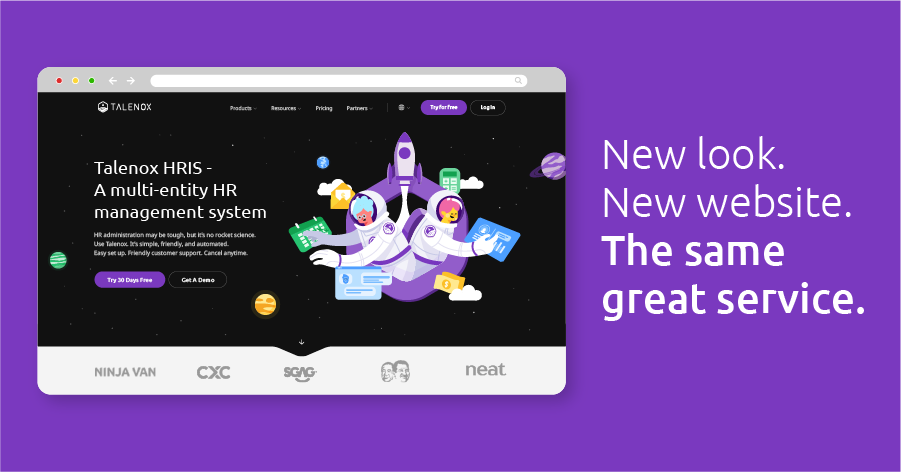
Yep, we’ve got a brand new website at Talenox.
You might have noticed changes in our logo, colours, and (even fonts) over the last few months. If you did, we applaud your attention to detail. That’s because we’ve been operating at stealth mode, making incremental changes to our brand. What you’re seeing now is the result of years of hard work.
The rebranding process
So how did this all come together? Simply put, we just knew it was time. It was one of those days where a few of us sat down and started reviewing the company’s growth. At that time, we realised we’ve made tremendous progress over the past few years. From new product features to new offices, we were really starting to evolve. And now, it was time for our brand to evolve, too.
Soon after, we launched a series of internal “brand-storming” (i.e. brainstorming) sessions. Each session required several hours to cover all ground on what the Talenox brand stands for. It comprised four to six key stakeholders each time (usually at least one of the founders and a couple of leaders from each department).
It was vital that the sessions took place outside the office, as we believed that removing ourselves physically from the office would help bring about a new “frame of mind”, fostering innovation and open discussion.
A moderator, a.k.a. “The Brand Manager” (this can be someone from an external branding agency, or if you decide to do this internally – a Marketing or Design Lead), would lead the sessions, covering topics such as “Establishing the Vision, Mission, and Brand Values” to “Selecting the Right Typography”.
Once all the “brand-storming” sessions are complete, the moderator (and a team of marketers, designers and copywriters) would collaborate to publish a final product – the brand’s “Holy Grail”, a.k.a. “The Brand Book”.

Introducing the new Talenox

The new Talenox highlights our intergalactic theme even more through starker colours (amethyst as the primary colour against a pitch-black canvas; with blue, green, yellow as the secondary ones), detailed illustrations, and a more distinctive brand personality and voice.
With the new “Brand Book”, we started implementing the rebranding process in phased rollouts, so that we could better control and examine the effects these changes brought.
More importantly, we wanted to stay committed to our long-time supporters and users by giving them what they need – reliability. As a company handling thousands of payroll transactions daily, we felt that our new branding shouldn’t come with “shock value”, but rather, be presented with thoughtfulness and care. The first step being, how it was introduced.
With that being said, one of the most subtle rollouts we started with was the logo.
The new Talenox logo, explained

It takes a keen eye to notice what’s different about our logo. For our new logo, we changed the logotype’s fonts to give it a more futuristic look (notice the “A” and the “X”). We also added a visual brand mark to accompany the logotype. Even though the brand mark looks relatively simple, there’s a meaning behind every line and stroke.
Let’s start off with the hexagonal shape. We took inspiration from beehives because we admired the way of the bees. Beehives are made of many hexagons, enabling bees to make very efficient use of space while using as little wax as possible. We loved efficiency. This resonated deep within us as we’ve always had a very lean team composition. In many cultures, the hexagon symbolises harmony as well, which would be very apt in fostering a strong team culture.
The next iconic symbol would be the pointy icon in the top half of the brand mark. This was meant to have double meanings – a cursor (representing a pointer in a computer interface), and a rocket (a component of our “space” theme).
Lastly, there are five lines that make up the “launchpad” or “ground” from which the rocket is launched from. The five lines represent our five brand values.

All elements combined, we have the new Talenox logo – a truly unique and representative aspect of who we are.
An outer space-inspired theme
Earlier on, we briefly mentioned the intergalactic theme.
We get it. From blockbuster movies to consumer product packaging, the “space theme” has gained massive popularity in the last few years. If everyone’s doing it, why did we still decide to follow suit?
Well … we technically didn’t. Since early 2015, we were already on the intergalactic bandwagon with our first rebrand. All of our team members (coincidentally) were space geeks, so it was only natural that we gravitated towards a space-inspired theme.
A few of our initial users also gave us feedback that the name “Talenox” sounded a little “out of this world”, since it wasn’t considered a proper word. We decided to roll with it.
We heard you, folks!
For the current rebrand, we decided to keep the original space theme because we still loved it. Furthermore, our vision was a large part of it.
Our Vision
This is our vision in its exact words:
“To augment an ecosystem towards endless human capital development.”
Talenox
To put it simply, we want to build something that would be an infinite source of adventure and achievement for our users.
With this vision, we had a good foundation in further creating more branding elements to emanate a feeling of pioneering innovation. The space theme suited what we had envisioned.
Brand personality
An important aspect of branding is the creation of a brand personality. In doing this, we asked ourselves: “If Talenox is a person, what would they be like?”
From our “brand-storming” (i.e. brainstorming) sessions, we distilled our brand personality down to a few words:
- Reliable (setting certain standards, competent)
- Professional (qualified and instructive, but not in a condescending manner)
- Relatable (empathetic and engaging)
- Playful (tongue-in-cheek and spirited, although never in a roguish way)
A unique trait I’d like to highlight is playfulness.
It may feel a little unusual to associate an HR department with this trait. However, it was also imperative that we started changing the world’s perception of the term, “HR”. “HR” is short for “Human Resources”, which technically is all about people after all.
As serious as most HR tasks sound (payroll, performance reviews, hiring and firing), there’s also the really good stuff that comes with it – the welfare, benefits, and holidays. By injecting a little playfulness into our branding, we hope to create more positive connotations for the HR industry as a whole.

So how do we let a brand’s personality show?
One way to do this is through the use of colours. We chose the “Amethyst Purple” as our primary brand colour due to these reasons:

- None of our direct competitors had this colour as their primary colour (distinction)
- Purple lies at the far end of the visual spectrum, which symbolises pushing towards the edge of the imagination (free association, creativity)
- Purple was traditionally associated with royalty and sophistication (quality brand image)
We also incorporated bolder colours in our designs (black instead of dark grey) and picked some contrasting colour pairings on the colour wheel (orange with blue, green with purple).
Besides the use of colours, tone of voice can also have a significant impact on the brand’s personality. We try to use an informal style of speaking (i.e. casual speech) when speaking to our users, so it’s more personable that way.
Brand mascots
One of the best ways to help the world visualise Talenox’s brand personality is through the use of brand mascots.
“By injecting a little playfulness into our branding, we hope to create more positive connotations for the HR industry as a whole.”
Talenox
We created illustrations of characters that reflect our engaging and warm nature. As shown in the image above, their body language is relaxed and confident, with a cheerful disposition.
The brand mascots also speak to our audiences in positive and inclusive ways, bringing heart and personality into an otherwise “cold and unfeeling” piece of technology. For each country that our system fully supports, we also try to incorporate local elements – such as landmarks and national icons.
So… what’s next for Talenox?
Our futuristic, space-themed branding is a reminder that there is always more to build. We’ll be launching more pages on our website in the coming months that speak more about our team, our products, and our future plans.
We’ll also be making some aesthetic changes to our application, making it more interactive and experiential, for both managers and employees alike.
As our company evolves, so will our brand. At Talenox, we design experiences for people, not personnel. We can’t guarantee that our branding will stay the same five years later, because peoples’ preferences, tastes, and needs will continue to evolve over time.
Rest assured that underneath each brand revamp, we’re still the same Talenox – committed to providing the same great service. We hope you like our new website. Let us know what you think.
Related posts:
 IR6036B表格解釋及申請指南:香港稅務知識26th Apr 2024
- Talenox Q1 2024 Updates: Automated features and more!15th Apr 2024
- What is the IR6036B Form in Hong Kong?28th Mar 2024
- New Pricing Plans, Annual Discounts, and a Sleeker Billing Dashboard28th Nov 2023
- Talenox Q3 2023 Updates: Streamlining Employee Management and Payroll12th Oct 2023
- 了解香港的418規則及其對你在現實生活中的影響26th Sep 2023


